Making Your Website Design Accessible
Web accessibility is the practice of ensuring that your website is accessible to people of all abilities. It is important for every brand and business to create a platform that is inclusive to people with different needs, as it allows equal access to online content and services.
Where can I find the guidelines to make sure my website is accessible?
The Web Content Accessibility Guidelines commonly known as the WCAG, is the internationally recognized standard for web accessibility. These guidelines provide a set of criteria organized by four main principles: Perceivable, Operable, Understandable, and Robust. In short, the WCAG’s primary goal is to ensure everyone can navigate the web without any constraints. igate the web without any constraints.
How do I get started?
While the WCAG provides a complete list of the guidelines needed to create your website, we have highlighted a few key ones that anyone (not just designers) can follow to update their website.
Guideline 1: Colour Contrast
Why is colour contrast Important?
One common mistake in brand design is not having enough contrast in colour palettes. While certain colours may seem visually appealing to you, they might not be legible to others. Low colour contrast in text can be particularly problematic, especially when the text is small, or the font is thin. Opting for harmonious colour combinations can help elevate your site’s design and improve its visual accessibility.

High Contrast Colour Combinations
How do I know if my colour palettes have sufficient contrast?
There are several ways to ensure that your colour palettes are easily readable. If you are working with a designer, ask them to provide you with a cheat sheet of good and bad colour combinations to better understand what to avoid. If you have decided to work without a designer, there are online resources available (such as the ones listed below) that allow you to input hex codes of your colour choices to receive a contrast rating:

Low Contrast Colour Combinations
Want to view your website through someone else's eyes? Try entering your URL into a colourblind web page filter, like this one here, to find anomalies that may be difficult for individuals with visual impairments to read.
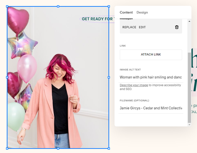
Guideline 2: Text Alternatives
What is Alternative Text?
Non-text content refers to anything on a website that is not text, such as videos and images. When incorporating non-text elements into your website design, you should always use Alternative (ALT) Text to describe what is visually being shown. ALT Text's primary goal is to explain the “why” of the non-text content and how it relates to the overall subject matter of your website.
What are the dos and don'ts of using ALT Text?
DO:
Use ALT Text to ensure that all viewers have equal access to your website's content and, in turn, improve your SEO (search engine optimization). By including ALT Text for videos and images, your non-text content will appear in search engine results, increasing your website’s visibility.
Use straightforward wording when writing ALT Text to make sure visually impaired visitors can easily understand your content.
DON’T:
Avoid using images with text except when necessary, such as in a logo or for branding purposes. While it may be tempting to use stylistic fonts in website banners, keep in mind that screen readers are unable to read the text, leading them to miss out on information. If you MUST use images with text, always remember to add ALT Text.
Guideline 3: Clear CTA’s and Navigation Instructions
What are CTAs?
Calls to Action (CTAs) are elements used in website design to prompt visitors to take specific actions. Typically displayed as buttons or links with text, CTAs motivate visitors to engage with other areas of a website. CTA links should be visually distinctive, descriptive, and unique. Avoid vague language that may sound redundant, like “learn more here” or “click this link”; instead, opt for descriptive text that clearly indicates what the viewer will find at the destination of the link. Get creative; this is your chance to be clever and thoughtful with your choice of words to get your audience to navigate different areas of your website.
Here are a few examples to inspire you:
Destination: About Page
Bad CTA: Click Here
Good CTA: Read Our Story
Destination: Blog Page
Bad CTA: Read More
Good CTA: Get the Scoop
Destination: Product Page
Bad CTA: Shop Now
Good CTA: Snag Your Style
How can I ensure my writing and instructions are clear and easy to follow?
When people visit your website, your aim is to encourage them to interact with your content. One effective way to do this is by using clear text and instructions throughout your site. While the task of writing instructions may seem straightforward, it’s important to remember that not everyone processes information in the same way. Your instructions should be easy to understand and presented in a logical sequence.
✿ Written By Tori Warkentin
Hey there! I’m Tori, the in-house writer at Cedar + Mint Co.! With a deep love for words and a passion for storytelling, I specialize in crafting engaging, insightful content that resonates with readers.