Building a Brand Identity: Interior Designers
Interior Design is all about creating spaces that are both functional and visually appealing. So, why should building your brand be any different?
In the world of Interior design, your brand is essential to your overall image. It gives future clients and followers a glimpse of your work. You want someone to visit your website or scroll through your social media and instantly get a sense of your design style. While a portfolio is excellent for showcasing your skills, the first impression is often made through your brand's aesthetic. Think of it as your personal art gallery, meticulously crafted to represent you.
When creating a brand for your interior design business, it's important to consider how you want to be perceived. Let's explore how you can elevate your branding by focusing on colours, fonts, and photo styling.
Pick the Perfect Colours
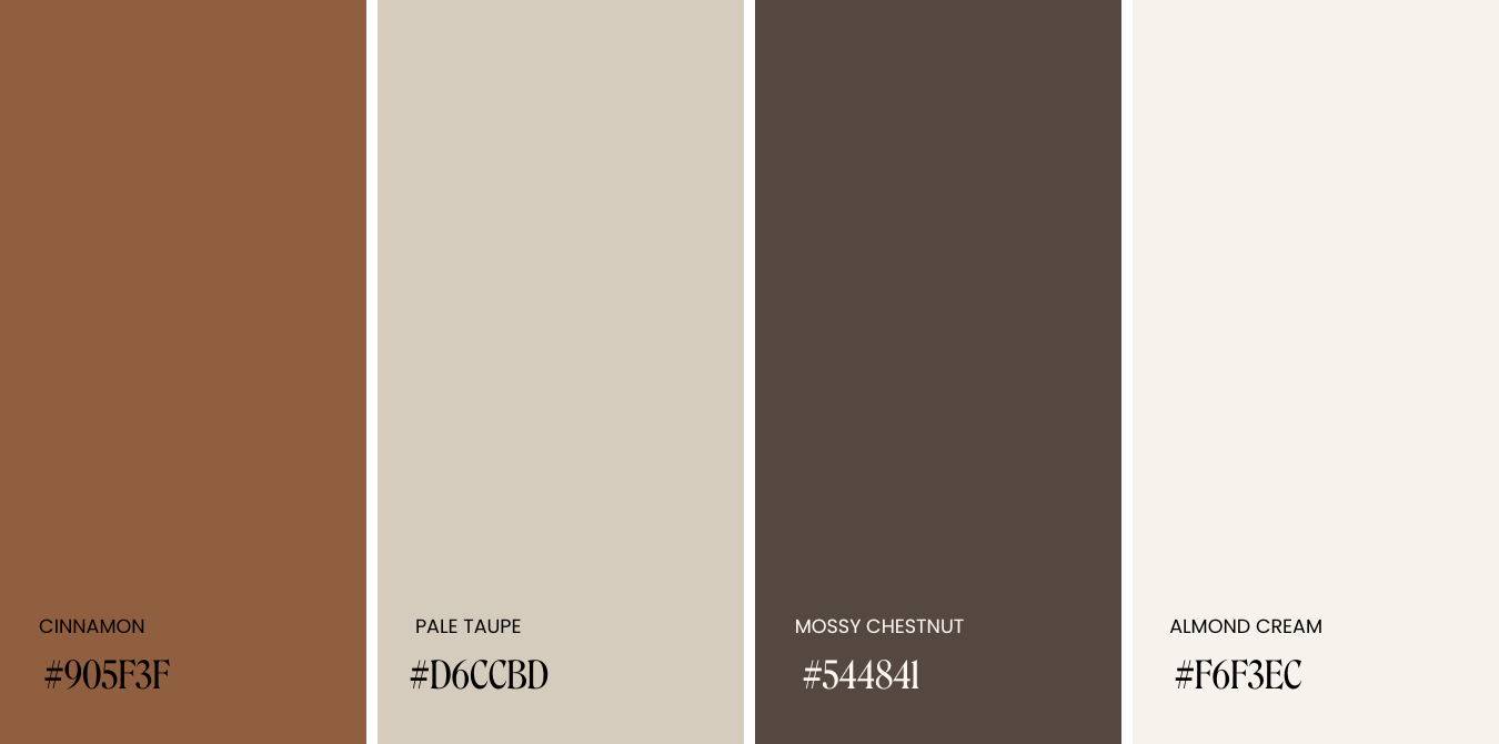
Colours are fundamental to your brand identity, evoking specific emotions and giving your audience an immediate sense of your design style. While vibrant colours can be engaging, sometimes it's best to turn down the colour dial and embrace a neutral palette, especially if you're aiming for a sleek, modern, or luxurious look. Consider using muted browns and grays paired with bolder or darker hues to achieve a chic look.
C+M Tips: Although neutral palettes are inherently stylish, adding a splash of colour to your brand design is a great way to elevate your image without overpowering your portfolio. Pair deep browns and grays with softened greens like olive or pistachio for a combination that is both eye-catching and calming, providing a natural and earthy touch.
Have Fun with Fonts
Fonts play a crucial role in brand identity, adding character and guiding viewers' attention. Selecting a font that complements your brand’s identity sets the tone for your audience, creating an emotional connection with potential clients. Try using fonts that are classic and minimal (especially for logos) to ensure readability across different platforms. Here are a few fonts that are great additions to any interior design brand:
Montserrat: a geometric sans serif that is excellent for readability and size scaling
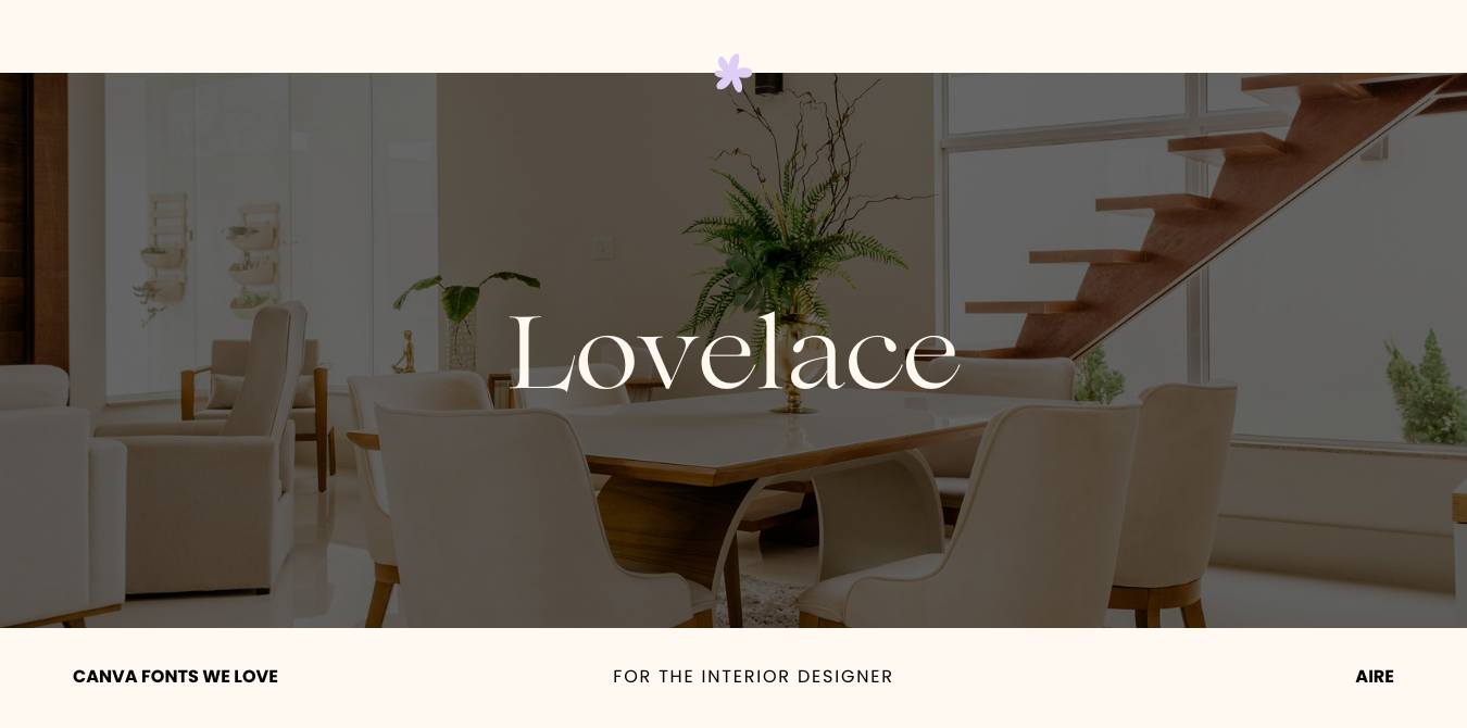
Lovelace: a sleek and stylish decorative serif font
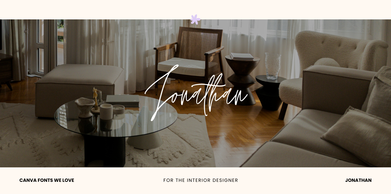
Jonathan: a handwritten script with an organic flow
C+M Tips: Experiment with pairing different fonts together. This is a great way to demonstrate your ability to blend various design elements while still adding a stylish and distinctive touch to your brand.
Master Photo Styling
High-quality and well-styled photos communicate your brand’s aesthetic and highlight your design expertise to potential clients. When showcasing your work, aim for simplicity and avoid cluttering the space; let the design itself be the focal point. We love adding small amounts of greenery or florals to a space to make it look more casual and lived-in.
Proper lighting is also essential to well-staged photos. Make sure that the space you are working in is well-lit to show off its features effectively. Natural light is always preferred, but strategic use of lamps and overhead lighting can enhance specific areas and create a pleasing ambiance.
C+M Tips: When preparing a space for an interior design photo shoot, consider applying the rule of three. This design principle suggests that groupings of odd numbers are more visually appealing than even numbers. You can also mix it up by using three items in different shapes or sizes—like vases or candles — to add depth and style.
✿ Written By Tori Warkentin
Hey there! I’m Tori, the in-house writer at Cedar + Mint Co.! With a deep love for words and a passion for storytelling, I specialize in crafting engaging, insightful content that resonates with readers.

