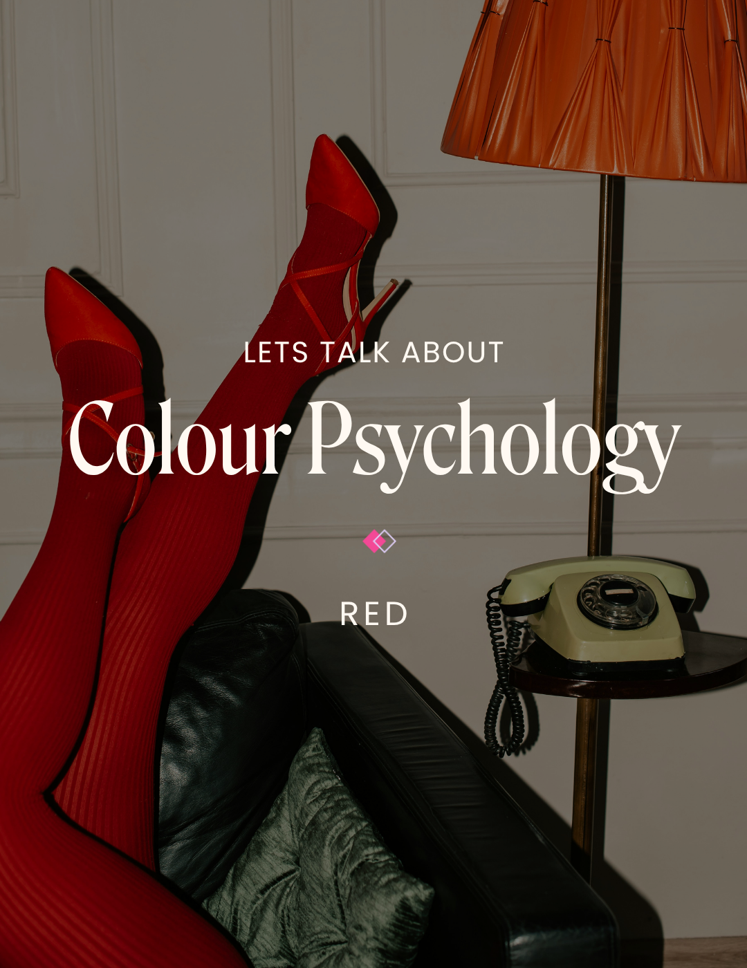
Seeing Red: The Psychology of Colour
Red is not a quiet colour. It's the colour of beating hearts and raised eyebrows. A celebration and warning bell. It holds contradiction beautifully — soft and romantic one moment, bold and commanding the next.
In the world of colour psychology, red sits confidently in the warm-toned family. While cooler tones create calm and clarity, warm tones spark energy and passion. And red is the most intense of them all. It energizes a space, seizes attention instantly, and leaves a lasting impression.
The Colour Red
A vibrant primary colour, red is emotionally charged and hard to miss. Studies show that viewing red can increase blood pressure, heart rate, and respiration - making it a powerful choice for any brand looking to leave a mark.
In branding, red communicates passion, love, excitement, but also danger and urgency. Used thoughtfully, red can spark connection and warmth. Used boldly, it can demand attention and create momentum. It’s no surprise some of the world’s most recognizable brands, like Netflix, Coca-Cola, and Target, lean into it. Red stands out on shelves, on screens, and in our memory.
Shades of Red

Candy Apple Red (Bright Red)
Bright red is energetic, bold, and ideal for urgent, excitement-driven branding. If you want your brand to radiate 'main-character' energy, then look no further; this shade is for you.
Best suited for:High- energy brands, food and beverage, entertainment and media
Maroon
A deeper, more grounded hue, maroon softens the vibrancy of brighter reds while still maintaining warmth and stability. Its depth communicates heritage, luxury, and trust — making it feel timeless rather than trendy.
Best suited for: Luxury branding, wellness brands, and editorial branding
Crimson
A happy medium between maroon and bright red, crimson is passionate yet refined. It is a romantic hue that works beautifully as a statement accent or within seasonal campaigns (think Christmas or Valentine’s Day).
Best suited for: High-end branding, eauty brands, and seasonal campaigns
Brick Red
With its earthy undertones, brick red provides branding with a nostalgic, approachable warmth. It's ideal for brands wanting a vintage flair or a natural, welcoming presence without overwhelming consumers.
Best suited for: Organic products, artisan branding, or hospitality brands
Tips for using orange in your branding
Be Intentional: Red is a very powerful and versatile colour. Choose a shade that speaks to the core of your brand. Do you want to energize your audience, create a sense of warmth, or add a touch of luxury? Once you’re clear on the feeling, choose the shade that aligns best with your brand’s core vibe.
Consider the Context: Because of its association with danger or urgency, think carefully of where and how you use red in your brand visuals. In wellness or therapeutic spaces, deeper maroons or purple-leaning reds can maintain warmth and impact without feeling alarming.
Add Warmth Through Imagery: Not ready to make red your primary brand colour? Try incorporating subtle pops of red through florals, textiles, and packaging accents. You’ll introduce passion and warmth into your brand without overwhelming your overall palette.
✿ Written By Tori Warkentin
Hey there! I’m Tori, the in-house writer at Cedar + Mint Co.! With a deep love for words and a passion for storytelling, I specialize in crafting engaging, insightful content that resonates with readers.