Mellow Yellow: The Psychology of Colour
What do the sun, a field of daffodils, and a rubber ducky have in common? If you guessed they're all yellow, you're halfway there! The real magic is in how they make us feel — filled with warmth, joy and optimism.
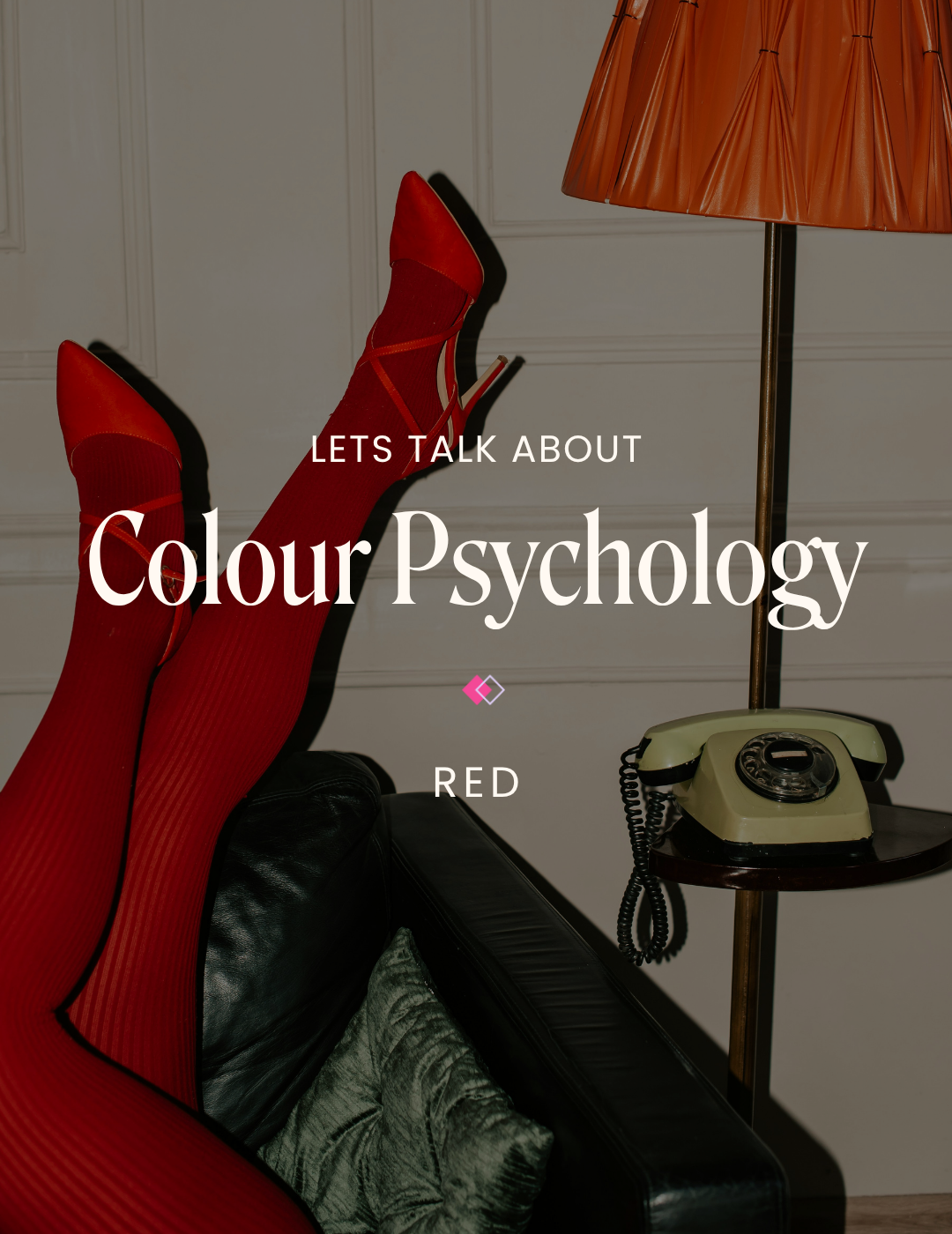
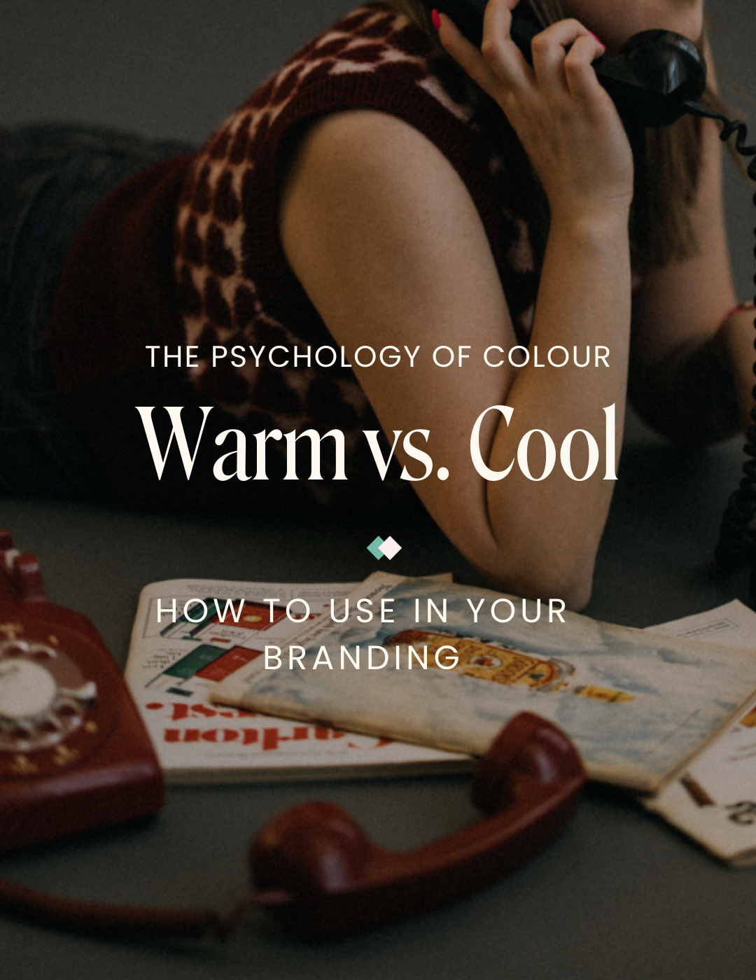
In the study of colour psychology, there’s a spectrum of warm and cool tones. While cool colours promote calmness and relaxation, warm colours provide energy and positivity. Pretty fascinating, right? It's almost like a little mood boost from the rainbow!
The Colour Yellow
A spirited primary colour, yellow falls within the warm-toned spectrum. It is a friendly colour that brightens any space and enhances your mood, bringing an extra bit of vibrancy and warmth wherever it goes. Whether used in website backgrounds or other marketing materials, yellow radiates playfulness, optimism and joy, leaving a lasting impression.
Shades of Yellow

Golden
Golden yellow is often linked with wealth, luxury, and wisdom. It’s an optimistic shade perfect for brands that want to convey a more upscale image.
Best suited for: Luxury brands, Beauty brands
Lemon
Zesty and fresh, lemon yellow is full of life. It’s the perfect pick-me-up color, evoking feelings of clarity, energy and joy.
Best suited for: Coaching and marketing, Education
Sunflower
Sunflower yellow is like a warm hug — strong and inviting. This shade bursts with positivity, enthusiasm, and joy and is an instant mood booster for your brand.
Best suited for: Food and beverage branding, Health and wellness
Mustard
Mustard yellow brings all the retro vibes! Its earthy tones suggest stability and reliability, with a nostalgic nod to the good old days. It's great for brands that want to feel grounded and timeless.
Best suited for: Vintage branding, Natural and organic products
Tips for using yellow in your branding
Be Bold: Yellow is a colour that demands attention! Use it strategically to make your brand stand out. We love incorporating yellow, whether it’s a small sticker on your packaging for an extra pop of colour or for a full background with large text to catch your audience's eye.
Mix and Match: Although we love the look of yellow in branding, sometimes it can be hard to read, especially when used in text or lettering. Try using black text with your favourite shade of yellow as the background to make your design pop! For more tips on colour contrast, check out our post, “Making Your Website Design Accessible!”
A Hint of Sunshine: Not a fan of using big blocks of colour but still want that hint of sunshine to radiate through your brand? Try adding this warm tone to your photography. Depending on your business, yellow can be shown in clothing, decor, or even florals to add that extra bit of joy.
✿ Written By Tori Warkentin
Hey there! I’m Tori, the in-house writer at Cedar + Mint Co.! With a deep love for words and a passion for storytelling, I specialize in crafting engaging, insightful content that resonates with readers.