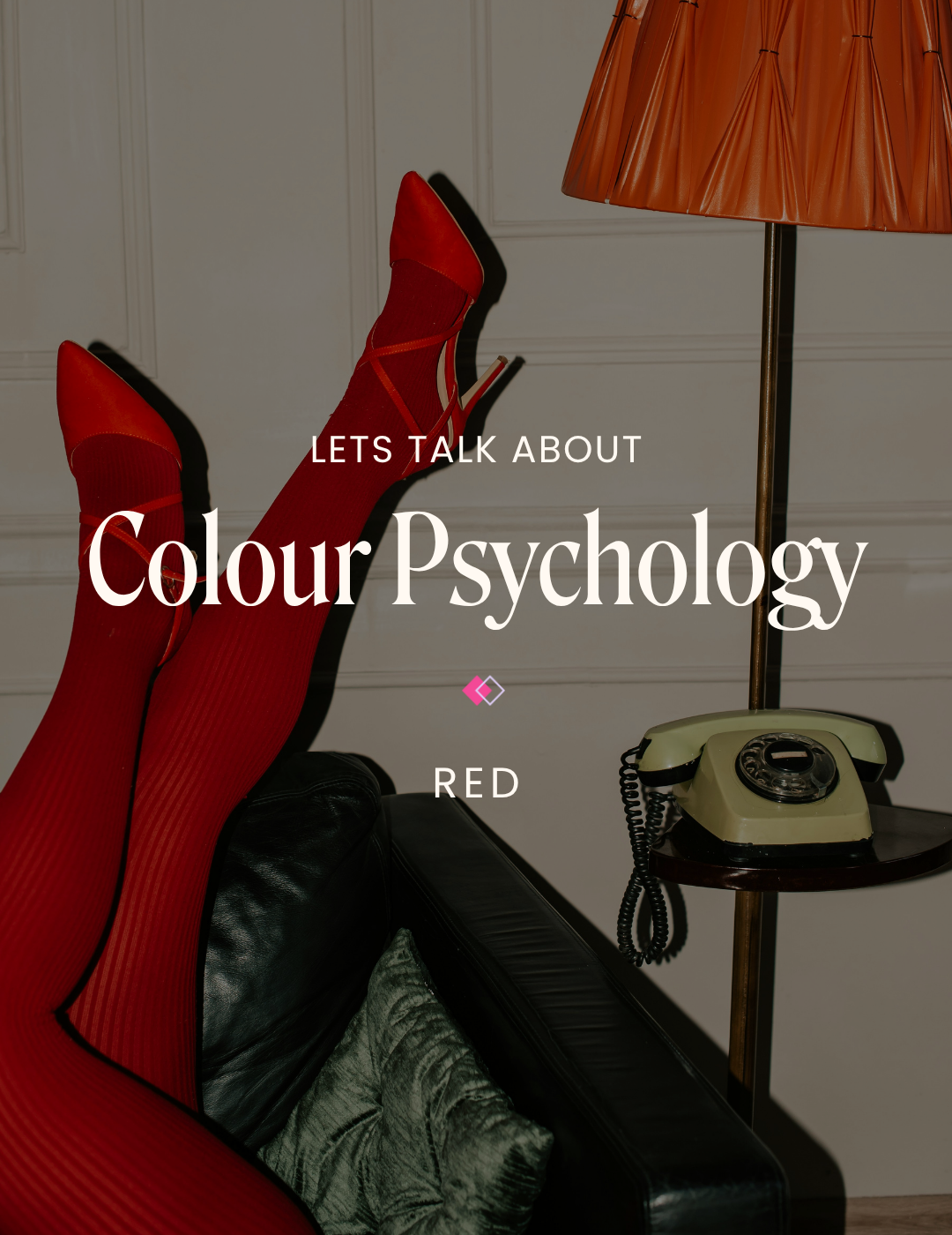
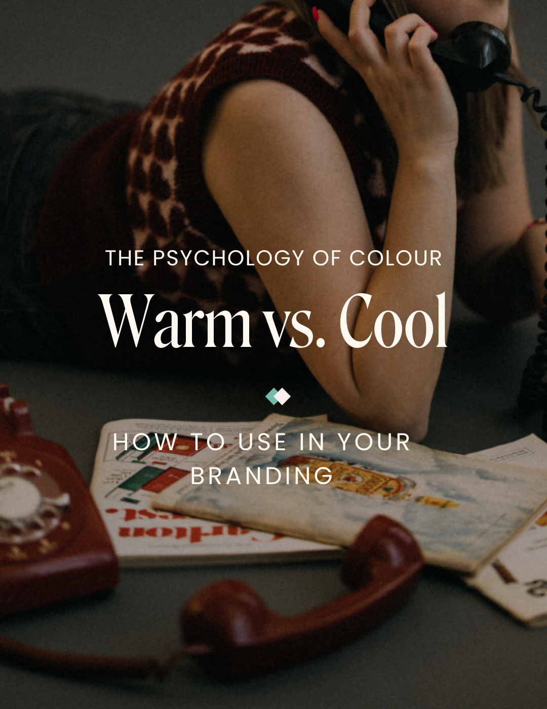
The Psychology of Warm vs. Cool Colours in Branding
Choosing a colour palette is about more than just looking good. Colour shapes emotions, perceptions, and the overall viewer experience, making it one of branding’s most powerful tools. The right colours will pull people in and quietly communicate how your brand feels before a single word is read.
Let’s break down the psychology of warm versus cool colours and the practical ways to use them in your branding—without overthinking the process.
Warm Colours: Energy, Passion & Optimism
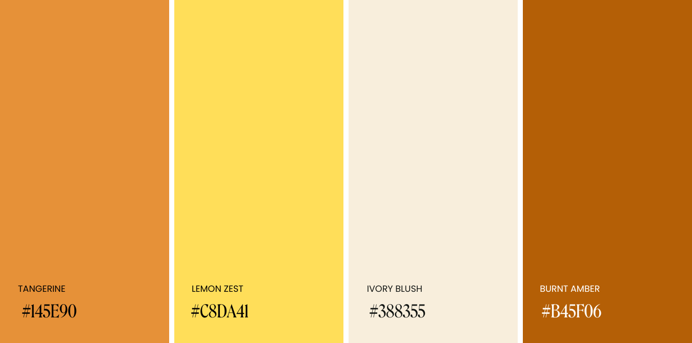
Warm colours like reds, oranges, and yellows are often linked to feelings of passion, excitement, and optimism. They naturally grab attention and encourage quick decision-making. Because they feel bold, welcoming, and energetic, warm tones are great for building momentum and motivating action in branding.

Joyful & Punchy

Rich & Natural
Bold & Radiant

Earthy & Grounded
Industries that use warm colour palettes:
Food & beverage
Retail & e-commerce
Sports & Fitness
Hospitality & travel
Examples:
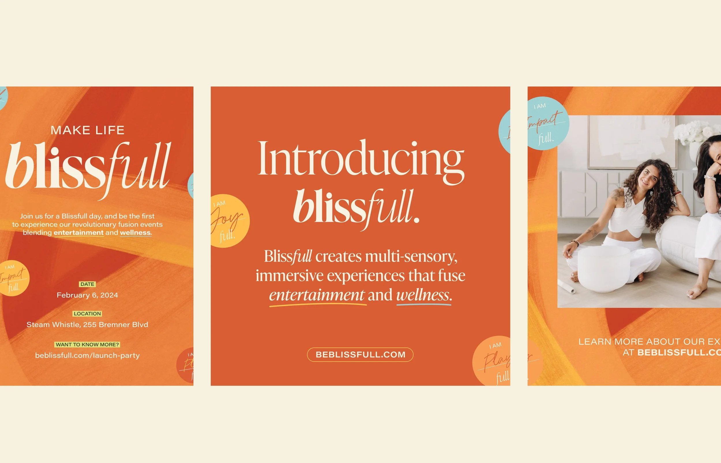
Blissfull: Events, Wellness | Warm Palette
Bright oranges, yellows, and vibrant green, balanced with a touch of cool blue for contrast.
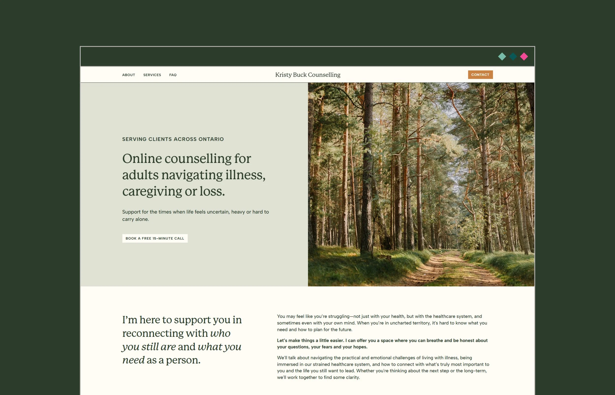
Kristy Buck Counselling: Psychotherapy, Wellness | Warm Palette
A warm palette that feels supportive and emotionally grounded.
Cool Colours: Calm, Stability & Trust
On the opposite side of the colour wheel, cool colours like blues, greens, and purples are associated with calm, trust and stability. These palettes tend to feel more soothing and organized, encouraging thoughtful engagement and long-term trust. They are an excellent choice for brands that want to build relationships with their audience rather than push quick sales.

Vibrant & Cool

Soft & Grounded
Moody & Natural
Fresh & Energizing
Industries that use cool colour palettes:
Technology & software
Finance
Healthcare & wellness
Consulting
Examples:
Winston Capital: Finance, Real Estate, Investing | Cool Palette
Blues paired with small pops of orange to draw attention to calls‑to‑action and key messaging throughout the website.
Oak & Honey: Luxury, E‑Commerce | Cool Palette
A refined cool base with small touches of warm gold used strategically for announcement bars and CTAs.


How Colour Shapes the Audience Experience (and Where It Works Best)
Colour’s most important role on your website is to guide the user experience. The most successful brands choose colours intentionally to shape how their audience feels and responds.
Warm colours stimulate the senses and encourage action, making them perfect for:
Call‑to‑action buttons
Announcement bars
Promotional highlights
Limited‑time banners
Sales or featured products
Cool tones help users feel calm and grounded, which makes them ideal for:
Navigation bars & menus
Backgrounds for text‑heavy sections
Footers
Infographics
Educational or how‑to content
Carousel posts
“I Want My Brand to Feel Warm — But I Love Blues & Greens?”
We get this question often—and the good news is that it is possible to have the best of both worlds. You don’t have to choose between one or the other.
Here's how to keep your colour palette cool while also creating warmth:
Use warm imagery
Sunlight, warm lighting, and golden tones through photography can instantly soften a cool palette.
Balance cool colours with warm neutrals
Pair blues and greens with:
Creams
Warm beiges
Soft taupes
Deep browns
This shifts your palette from cold and clinical to cozy and inviting.
Add texture
Natural textures go a long way in warming up a brand. Think organic elements like:
Linen and paper
Clay and ceramics
Wood, moss, stone, and water
Add warmth through your brand voice
Colour doesn’t work alone; your tone and voice are also essential to the viewer's experience. An approachable and supportive tone adds emotional warmth no matter the colour palette.
Opt for muted cool tones
Highly saturated blues often feel corporate and tech‑heavy. Pulling back saturation creates a more grounded, earthy feel that blends beautifully with warm neutrals. (tip: skip the neons.)
Mixing Warm & Cool Colours = Creating Balance & Contrast
Most strong colour palettes use a mix of warm and cool tones, allowing each to shine while still creating visual contrast.
When building your palette, include:
A light neutral
A mid-tone colour
A deep tone
We love the 60 / 30 / 10 rule:
60% neutrals
30% primary brand colour
10% accent colour for call-to-actions or key elements
This approach keeps your brand cohesive while still allowing both tones their moment in the spotlight.
Examples:
Toronto Lymphatic Academy: Educational, Wellness | Warm + Cool Combined
Cool blues and greens paired with deep oranges, dark browns, creams, and a vibrant green to add warmth and energy.
Landed Therapy: Psychotherapy, Wellness | Cool Palette with Warmth
A grounded deep burgundy, sitting between warm and cool, softened with warm neutrals to create a safe, inviting feel.


So, Should You Choose Warm or Cool?
The right palette depends on your industry, audience, and desired emotional experience. Warm colours invite connection and action while cool colours offer calm and clarity. The real magic often happens when you find the perfect mix of both.
✿ Written By Tori Warkentin
Hey there! I’m Tori, the in-house writer at Cedar + Mint Co.! With a deep love for words and a passion for storytelling, I specialize in crafting engaging, insightful content that resonates with readers.