Building a Minimalist Brand Identity
Minimalist branding has become the go-to choice for businesses that want to cut through the clutter and keep things intentional and memorable. By focusing on simplicity, brands can create designs and experiences that feel effortless yet leave a lasting impact on their audience.
Think of iconic brands like Apple and Aesop. Both are masters of the “less is more” approach—clean design, thoughtful details, and a consistent look that instantly sets them apart. They are able to give off a luxurious and exclusive feel, while still staying stripped down and straightforward.
But here is the key: minimalist branding isn't about stripping away your brand's personality; it's about building a space where your work, products, and services can take center stage. Rather than competing with what you do, your branding should support it—ensuring your audience has the best possible experience when interacting with your business.
Who is Minimalist Branding Best for?
Minimalist design works especially well for businesses and professionals who want their products and services to take center stage. Some great fits include:
Interior Designers & Creatives (e.g., Tiffany Leigh Design, Leah Simpson Design, Madison Taylor)
Photographers, Artists, & Makers
Skincare, Estheticians & Wellness Brands (e.g., Merit Beauty, Aesop, Glossier, The Ordinary)
Tech Companies (e.g., Apple, Google)
Design Elements of Minimalist Branding
1. Fonts
Stick to 1 or 2 fonts max. If you want more variety, select fonts with various weights (light, regular, bold, italic) to maintain cohesion.
Avoid decorative or script fonts. Minimalism thrives on clarity, and stylized fonts can create unnecessary clutter.
Embrace white space. Give your fonts room to breathe around headlines, between paragraphs, and across your layout. Keep your copy short, snappy, and clear. Minimalist brands need to embrace minimalism in their aesthetics AND their tone and messaging.
Free minimalist font picks:
Google Fonts:
Fontshare:


2. Color Palettes
Minimalism doesn’t have to mean stark black and white. While a monochrome palette can feel sleek and elevated, adding a touch of colour, even in a small way, can bring mood and personality to your brand.
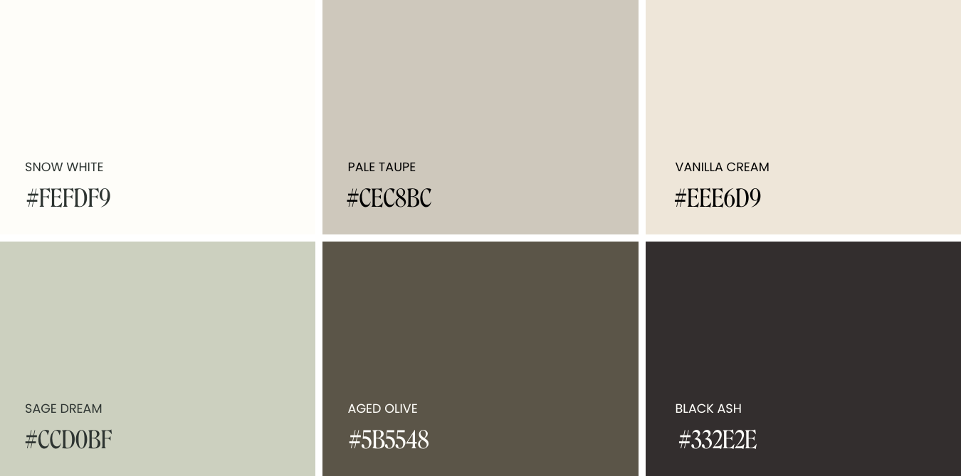
Colour Palette #1: Earthy Minimalism
Mood: Neutral, Grounded & Inviting.
Snow White #FEFDF9
Pale Taupe #CEC8BC
Vanilla Cream #EEE6D9
Sage Dream #CCD0BF
Aged Olive #5B5548
Black Ash #332E2E
Colour Palette #2: Romantic Minimalism
Mood: Moody, Vintage, Balanced & Warm.
Chocolate #2E070B
Dusty Rose #D4B3AB
Soft Cream #ECD8CF
Floral White #FBF6F4

Putting It All Together
When fonts, colours, and whitespace align, you create a brand environment that feels balanced and intentional.
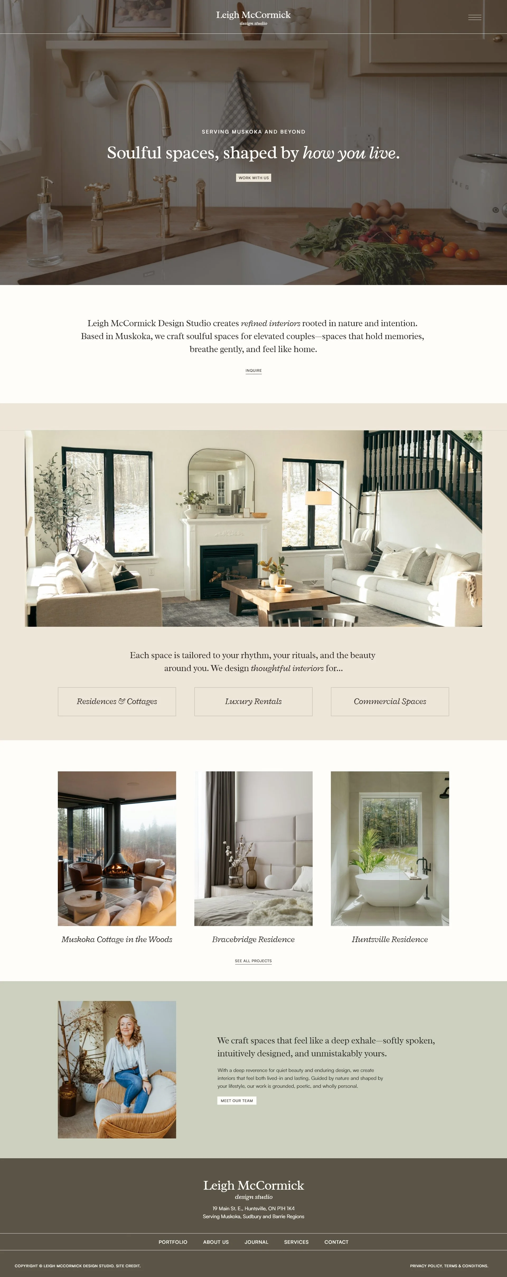
Take Leigh McCormick Design Studio, for example:
Fonts: Radley (Headings), Satoshi (Paragraph)
Colours: Earthy Minimalism Palette
The result? A calm, neutral backdrop and clear font choices, letting Leigh’s interior shine while still reflecting her brand's polished style.
Ready to create your own minimalist brand identity? Browse our Pinterest board for some inspiration.
✿ Written By Tori Warkentin
Hey there! I’m Tori, the in-house writer at Cedar + Mint Co.! With a deep love for words and a passion for storytelling, I specialize in crafting engaging, insightful content that resonates with readers.