Orange You Glad?: The Psychology of Colour
Orange isn't just a colour—it's a whole mood. It’s a burst of creativity, a pop of happiness, and the ultimate confidence boost. While everyone may have their own personal associations with orange, one thing always rings true: it's a colour that knows how to stand out and get noticed.
Enter colour psychology—the fascinating study of how colour influences our emotions and perceptions. In simple terms, it's all about how different colours make us feel. For branding and design, colour psychology is like a secret weapon. The colours you choose can spark emotional connections, shape how your audience sees you, and communicate your brand’s essence without saying a single word. Pretty cool, right?
The Colour Orange
A bold secondary colour, orange, lives between fiery red and vibrant yellow on the colour wheel. This warm-toned colour is often associated with mood-boosting qualities like enthusiasm, optimism, and playfulness, making it an ideal choice for injecting energy and personality into your brand. With a versatile range of light and darker shades, orange can adapt to various branding needs—whether you're aiming to inspire creativity, spark joy, or simply stand out. It’s a colour that speaks volumes and connects with an audience ready to engage.
Shades of Orange
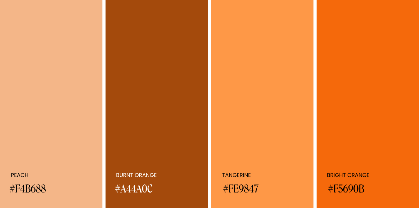
Peach
Soft and gentle, peach is like a warm hug—offering all the warmth of orange in a more subtle, soothing tone. This toned-down hue is perfect for brands looking to create a sense of comfort, approachability, and calm.
Best suited for: Beauty & skincare brands, Wellness brands, Home Goods & Accessory Brands
Burnt Orange
Grounded and earthy, burnt orange is a hue rich in depth and warmth. It offers a more mature, sophisticated twist on traditional orange tones, creating just the right amount of boldness and sophistication for brands that want to feel approachable yet elevated.
Best suited for: Eco-friendly & nature-inspired brands, Therapists & Wellness Practitioners, Luxury & Designer brands
Tangerine
Just like the fruit it's named after, Tangerine is a zesty and refreshing shade. It’s vibrant, playful, and impossible to ignore, making it the perfect choice for brands that want to make a bold, upbeat statement.
Best suited for: Food and beverage branding, Health and fitness brands, Sporting Goods
Bright Orange
The most daring of shades, bright orange, is a vibrant hue that, when used right, grabs viewers' attention and leaves them wanting more. With its high impact and unmissable radiance, bright orange is perfect for brands that want to target a lively and energetic audience.
Best suited for: High energy brands, Tech Brands, Festivals & Event Branding
Tips for using orange in your branding
Leave the Right Mark: Like many colours in branding, orange is incredibly versatile and can work across a wide range of industries and brand personalities. The key? Choosing a shade that aligns with your brand’s essence. If you’re building a luxury or high-end brand, opt for deeper, more muted tones like burnt orange to convey warmth and sophistication. Brighter shades, while fun and full of energy, can sometimes come off as too playful for upscale aesthetics.
Proceed with caution: As much as we love a great orange, it can be one of the trickier colours to print. Digital screens offer a wider range of vibrant oranges than most printing inks can replicate. If orange is your brand colour, start by selecting a print-friendly version first—then match it digitally for the best consistency.
Pair it Wisely: While orange is a fantastic colour on its own, pairing it with complementary hues can make it stand out even more. Try combining it with cooler-toned colours like green, blue, or purple to create a striking contrast and visual balance. These pairings can help tone down orange’s intensity while allowing its warmth and vibrancy to shine.
✿ Written By Tori Warkentin
Hey there! I’m Tori, the in-house writer at Cedar + Mint Co.! With a deep love for words and a passion for storytelling, I specialize in crafting engaging, insightful content that resonates with readers.


