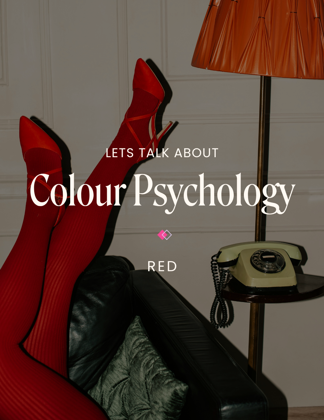
Font Pairings: Elegant & Luxurious Brands
When it comes to branding, every single detail matters—and your font choices are no exception. Whether you are building a brand for a high-end fashion label, an interior design company or a niche event planning business, one thing remains true: the fonts you choose speak just as loudly as your words.
In this post, we’ll explore four luxurious font pairings that can elevate your brand identity—and the best part? They’re all completely free to use.
What Counts as a “Luxury Brand”?
Luxury branding spans a wide range of industries—from fashion and accessories to real estate and event planning. And while each brand has its own personality, luxury visuals often share a few key traits:
Small Fonts/ Minimalism: Luxury branding rarely uses large, in-your-face style typography in its design. Instead, elegant brands often opt for small, refined typography that lets the product or service take center stage.
Serif Fonts: Many luxury brands—especially in fashion—use classic serif typefaces in their logos. Why? Serifs often evoke heritage and timelessness, making them a subtle nod to legacy and prestige.
Sans Serif: Clean and geometric sans serifs, like Futura, are another favorite in high-end branding. Sans Serifs give off a modern and polished feeling, especially in all-caps headlines paired with sentence-case body text.
A Quick Word on Font Licensing
Before we discuss the pairings, we thought it would be helpful to explain where these fonts come from and how they can be used.
Google Fonts offers fonts under open-source licenses, which means they are free to use, modify, and redistribute. Open-source fonts are perfect for brands wanting flexibility and long-term accessibility. You can embed them in websites and use them for packaging and labels without worrying about copyright issues.
Font Share (by the Indian Type Foundry) also offers free fonts for personal and commercial use. However, these are considered closed-source, as they cannot be modified or redistributed, and must be obtained directly from their website. While this may add some limitations, it helps maintain design integrity while offering access to high-quality typefaces.
Free Font Pairings for that Luxe Look

Pairing #1: Traditional & Stylish
Headline: Erode
Paragraph: Mona Sans
Erode’s refined, high-contrast serif letterform evokes an old-world sophistication, perfect for brands that want to pay homage to the past. Mona Sans balances the pairing with a clean and more traditional touch. This elegant duo is perfect for luxury fashion or any business looking to give off an upscale appearance.
Keywords: Traditional, Vintage-Inspired, Sharp, Expensive, Editorial, Stylish

Pairing #2: Modern & Chic
Headline: Instrument Serif
Paragraph: Public Sans
Instrument Serif is a sophisticated and more modern take on a traditional serif. Paired with Public Sans' neutral and professional appearance, this combo gives off an effortless editorial aesthetic. This pairing is a great choice for contemporary beauty brands as well as the wellness industry.
Keywords: Modern, Editorial, Chic, Accessible

Pairing #3: Soft & Whimsical
Headline: Sentient
Paragraph: Questrial
Sentient blends softness and sophistication with a hint of whimsical flair, while Questrial's smooth curves and open letterforms make it a perfect lightweight companion. This pairing is ideal for brands looking to give off a romantic and timeless vibe, like a high-end boutique or an event planning business.
Keywords: Soft, Feminine, Whimsical, Timeless

Pairing #4: Timeless & Unique
Headline: Aboreto
Paragraph: DM Sans
Aboreto is unique and artistic, with playful curves that stand out while still feeling upscale. DM Sans anchors the look with a clean, geometric base, keeping the pair grounded. This pairing is great for brands looking to stand out while still feeling luxurious—think artisan brands or luxury businesses.
Keywords: Modern, Stylish, Unique, Timeless
Tips and Tricks for a Polished Look
Choosing the right fonts is one thing, but how you use them is also very important. Keep these best practices in mind to maintain that high-end, editorial look across your brand:
Use script fonts sparingly: While they can be eye-catching as an accent or subheading, they may make your design hard to read when used in excess. Save the delicate details for decorative purposes, and use your main header font to communicate important information.
Stick to 2-3 fonts max: It can be tempting to use a wide variety of typefaces to make your site feel unique, but too many fonts will clutter your design and confuse your audience. Limiting your brand to just two or three fonts will keep your visuals clean and legible.
✿ Written By Tori Warkentin
Hey there! I’m Tori, the in-house writer at Cedar + Mint Co.! With a deep love for words and a passion for storytelling, I specialize in crafting engaging, insightful content that resonates with readers.