Feeling Blue?: The Psychology of Colour
Have you ever wondered why shades of light blue have a calming effect on your mood? Or noticed how you feel more productive and focused in a room with navy walls?
The answer to these questions lies in the fascinating world of colour psychology. Colour psychology studies how colours influence our moods, thoughts, and behaviours. In branding and website design, colour psychology plays a huge role in the creation process. It communicates your brand's values and leaves a specific impression on potential clients. Pretty cool, right?
The Colour Blue
Blue has become one of the most popular colours in branding and design. Big companies like Facebook, Samsung, and Ford have jumped on the blue trend, using it to promote their businesses. But why is everyone so obsessed with this colour?
Blue is popular in branding because of its widespread and impactful associations. At its core, it embodies trust, serenity, loyalty, and logic, but its different shades and hues can evoke a wide range of emotions.
Shades of Blue
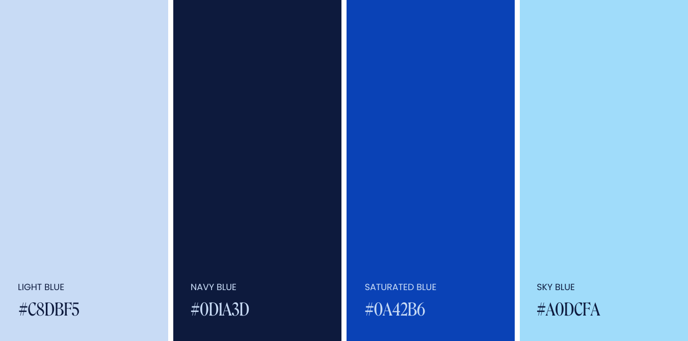
Light Blue
Shades of light blue have a calming effect. They often represent innocence and youthfulness, giving off vibes of serenity and clarity.
Best suited for: Healthcare and Wellness, Education
Navy Blue
A dark and commanding colour, navy blue promotes feelings of security and stability. It is a confident shade linked with connotations of intelligence and loyalty.
Best suited for: Corporate Branding, Luxury Brands
Saturated Blue
Saturated blues ooze enthusiasm and motivation. These vibrant shades are great for getting creative juices flowing as they increase motivation and energy.
Best suited for: Beauty Branding, Non- Profits
Sky Blue
Sky blue is light and airy, like a breath of fresh air. It symbolizes relaxation and openness, evoking feelings of freedom and inner peace.
Best suited for: Travel and Leisure, Fashion Brands
Tips for using blue in your branding
Pick the Perfect Shade: Choose a shade of blue that matches the vibe you want your brand to give off. Think light blues for calmness, navy for confidence — you get the idea!
Make it Pop: If you want your brand to feel bold and confident, use blue as the focal point of your website design. Use it in your website’s background, headings, or graphics to grab attention.
We Love a Logo: Incorporate blue into your logo design. It will instantly add a touch of trustworthiness to your brand identity.
Spreading the Blues: Use blue in your marketing materials, such as newsletters and social media posts, to encourage engagement and leave a positive impression.
✿ Written By Tori Warkentin
Hey there! I’m Tori, the in-house writer at Cedar + Mint Co.! With a deep love for words and a passion for storytelling, I specialize in crafting engaging, insightful content that resonates with readers.