Adding Movement to your Brand
In a creative digital world, currently inundated with the minimalist trend of using solid colours, straight lines, and clean typography, emerging brands are finding it increasingly difficult to stand out. Although there are various techniques to enhance a brand's overall aesthetic, one of our favourite methods is incorporating touches of movement throughout a brand or website.
When envisioning movement within brand design, you might be quick to picture the more elaborate visual stimuli like videos or animated gifs. Even though these elements can undoubtedly leave an impact, integrating more subtle forms of movement throughout your branding provides a gentler touch that elevates the overall viewing experience without being overwhelming or distracting.
Through conversations with numerous clients, we have found that, despite the allure of simplicity in the minimalist trend, it lacks the touch of humanity and emotion that consumers seek in a brand. While there are many thoughtful strategies for incorporating movement into your brand, we've curated four of our favourite tried-and-true tactics to help your brand attract viewer attention.
Explore Textured Backgrounds
Movement is inherently attention-grabbing. Our brains are hardwired to respond to motion, making it a valuable tool for brands to stand out. At Cedar + Mint Co., one of our favourite ways to incorporate movement into branding is through textured backgrounds. While this trend might appear relatively new, it has been steadily gaining traction across the market as a means to capture consumer interest. Haven't spotted it yet? Next time you open your Starbucks app, pay attention to the background. Notice the grainy patterns, gradients and hand-drawn wavy lines adorning the banners and packaging. Each intricately textured detail draws people in, creating an enjoyable and eye-catching experience guaranteed to encourage repeat visits.

How to Get Started: To find the perfect textured background for your brand, consider what textures resonate most with you. Do you lean towards something more natural and hand-drawn? Or do you prefer digital gradients and organic 3D shapes? Make sure to take a moment to reflect on how you would like your product or brand to interact with its audience.
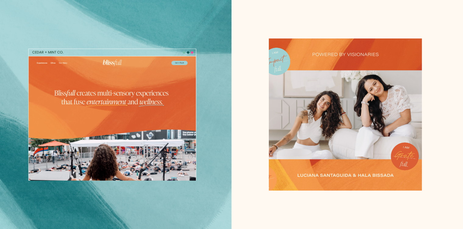
We have included an example from one of our clients' websites below to provide insight into how textured backgrounds can elevate your brand. With Blissfull, our goal was to create an energetic brand that represented our clients' flowing energy and activations in each of their experiences. Using organic, free-flowing brushstrokes and layering opposing colours, we crafted textured backgrounds that infused Blissfull’s design and aesthetic with vitality.
Get Looooose with your Fonts
In branding, every visual aspect carries weight. While typography might not initially seem like a critical visual detail, selecting a dynamic font can significantly influence how a brand is received. When it comes to movement, the fastest way to add a subtle yet organic touch to your brand identity is to incorporate small elements featuring handwritten fonts into your designs. Whether for an annotation on an image or for a gentle call-out to visitors on your site, these loose organic fonts will set your brand apart.
How to Get Started: When looking for a font for your brand, explore ones that are easy to read and have a more natural appearance. Keep in mind that handwritten fonts should be used sparingly (especially in big blocks of text) as they can sometimes be hard for people to read. And remember, NEVER put scripts in all caps!
At Cedar + Mint Co., we love using fonts that are slightly imperfect and have a natural flow. Below, we have included a small selection of engaging fonts for you to explore for your next project:
Canva Fonts: The Artist Script, Grimpt Script, Sweet Belly, Lazy Dog
Creative Market: Des Montilles by supfonts, Honeymoon Hand by Nicky Laatz, Juniper Bay by Type Heist, Wild Soul by Pixel Colours
If you are looking for something a bit bolder, fonts with flourishes and curls make excellent choices for large headings. Instead of using some of the more oversaturated fonts from places like Canva and the Creative Market, we suggest looking at foundries to find fonts that are more unique. Check out four of our favourites: BN Lazzars by Brandon Nickerson Studio, Aespira by Typeverything, Spindle by Gor Jihanian, Dopple by Colophon Foundry
Play with your Photography
While video and motion graphics are most likely the first things that come to mind when considering adding movement to your brand, an excellent alternative is using static images that depict motion. Static imagery has long been a staple of brand communication. Although it is a great way to present products, it can sometimes lack the liveliness and dynamism that movement creates. A fun and easy way to add movement into photography is to take photos of products in motion.

How to Get Started: Introducing movement into your photography can elevate the presentation of your product or service and invigorate your brand with a sense of vitality. It can be as straightforward as capturing a sandwich being sliced or a can being opened, or you can delve into more intricate compositions by experimenting with light and shadows. The artistic possibilities are endless!
For those aiming to cultivate a slightly moodier brand image, we suggest experimenting with various shadow effects. One effective method to create the illusion of shadows is to shine light through plants to create a wind-blown effect. The key to perfecting this technique lies in taking multiple photos in quick succession to accentuate the subtle, blurred motions of the moving foliage.

Apply Organic Shapes & Illustrations
Utilizing shapes and illustrations in brand design offers an effective method to infuse energy and buoyancy into your creative space. Unlike rigid designs, organic artwork flows with natural curves and contours, evoking a sense of vitality and liveliness. From our experience, integrating rough, organic, hand-drawn shapes and illustrations enhance a brand’s overall appearance by adding a natural sense of movement.
How to Get Started: When selecting shapes and illustrations to incorporate into your brand, consider how you want your brand to be perceived. For those aiming to create a luxurious viewing experience, pair neutral colours alongside splashes of black to achieve a dramatic and attention-grabbing effect. Conversely, if you seek to incorporate playful and energetic undertones throughout your brand, integrating hand-drawn elements is an excellent approach to liven up your image. These handcrafted designs do not need to be perfect; embrace experimentation with different styles and shapes, tapping into your creative imagination for inspiration.
✿ Written By Tori Warkentin
Hey there! I’m Tori, the in-house writer at Cedar + Mint Co.! With a deep love for words and a passion for storytelling, I specialize in crafting engaging, insightful content that resonates with readers.