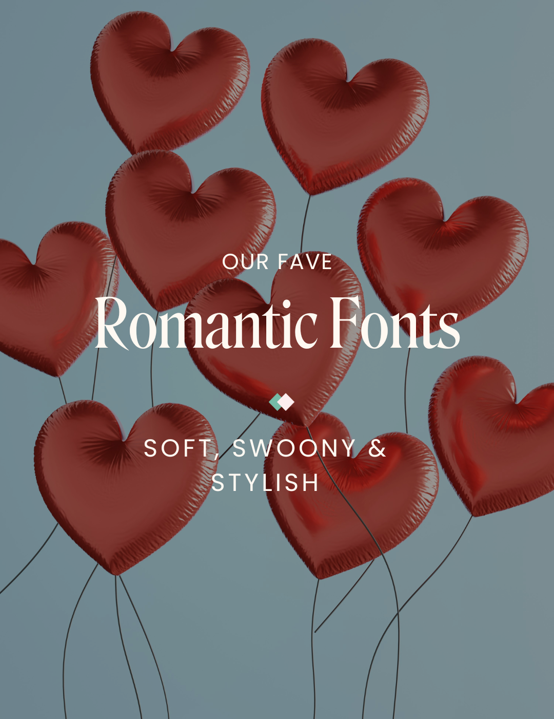
Must-Have Fonts for Photographers: Top 3 Canva Picks for Your Brand
Being a photographer is all about capturing those perfect moments and telling stories through your lens. But when it comes to showing off your business and portfolio, the right font can make or break your brand.
Fonts play a huge role in your branding, presentation, and overall identity. Just like trying to make a good impression when meeting someone for the first time, your fonts give off the essence of your brand's design and style, so picking the right one is essential!
With so many typeface options, we know it can get a bit overwhelming when trying to pick the perfect font for your business, but don't worry — we have you covered. We rounded up three of our favourite Canva fonts that are perfect for photographers who want a more classic look. Check them out below!
Eyesome Script
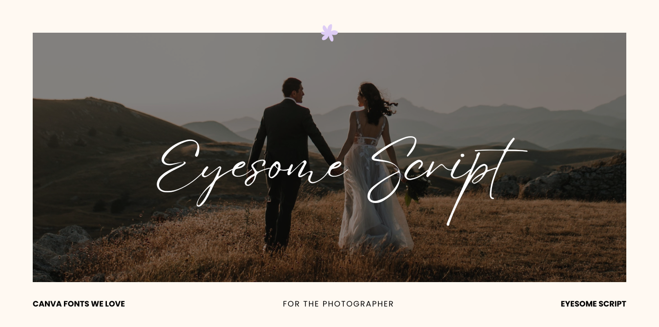
Eyesome Script is a fluid and organic typeface that gives off an air of elegance. This font is very versatile and great for large text. We love the hand-drawn style of this script, as it adds an extra human touch to your brand.
Best used for: Image Overlays, Printed Cards and Invitations, Photo Albums
Black Mango

Black Mango is a classy sans-serif font that combines traditional text with a modern flair. Its bold lines and contrast between thick and thin lines are reminiscent of the Art Deco era, making it a fantastic choice for photographers looking to create a timeless brand aesthetic.
Best used for: Brand Logo, Website Headers and Titles, Social Media Graphics
TT Commons Pro

TT Commons Pro is a modern sans-serif font that is clean and versatile. This no-nonsense font is an excellent choice for text-heavy parts of your brand or website. Its contemporary and minimalist appearance also makes it a great font to pair alongside other more vibrant styles (like Eyesome Script!).
Best used for: Photo Captions, Body Text, Watermarks, Brand Logos
The Do’s and Don’ts of Fonts:
Do:
Pair different fonts together, but make sure they complement each other. For example, we love pairing TT Commons with Eyesome Script.
Stick to the same fonts across your brand/website to maintain a cohesive identity.
Use a visual hierarchy to give your website a clear structure.
Don’t :
Use fonts that are hard to read or overly intricate.
Overdo it by using too many different fonts; remember that less is more.
Use the same font size throughout your website, as it can confuse visitors and disrupt the visual hierarchy. We recommend making your heading and body copy drastically different sizes.
✿ Written By Tori Warkentin
Hey there! I’m Tori, the in-house writer at Cedar + Mint Co.! With a deep love for words and a passion for storytelling, I specialize in crafting engaging, insightful content that resonates with readers.