Finding the Right Logo for Your Brand
Choosing the right logo for your business is a big decision. It's often the most recognizable and important part of your brand identity. Like wearing a signature outfit, your logo should communicate who you are and what your brand stands for. But with so many styles to choose from, how do you know which style will best fit your brand?
Don't worry! We've got you covered. Below is a breakdown of seven popular types of logos to help you find the perfect match for your brand's unique personality:
Wordmark + Logotypes
Wordmark Logos are all about keeping things simple with no added fuss. These logos are strictly text-based, using specific typefaces to make a statement. A wordmark is a great choice for brands that want their focus to be on their messaging and use of design assets (think colours, fonts, web design and social media design) to carry their look and stay recognizable to their audience.
Examples: Google, FedEx, Crate&Barrel, Facebook, The Ordinary

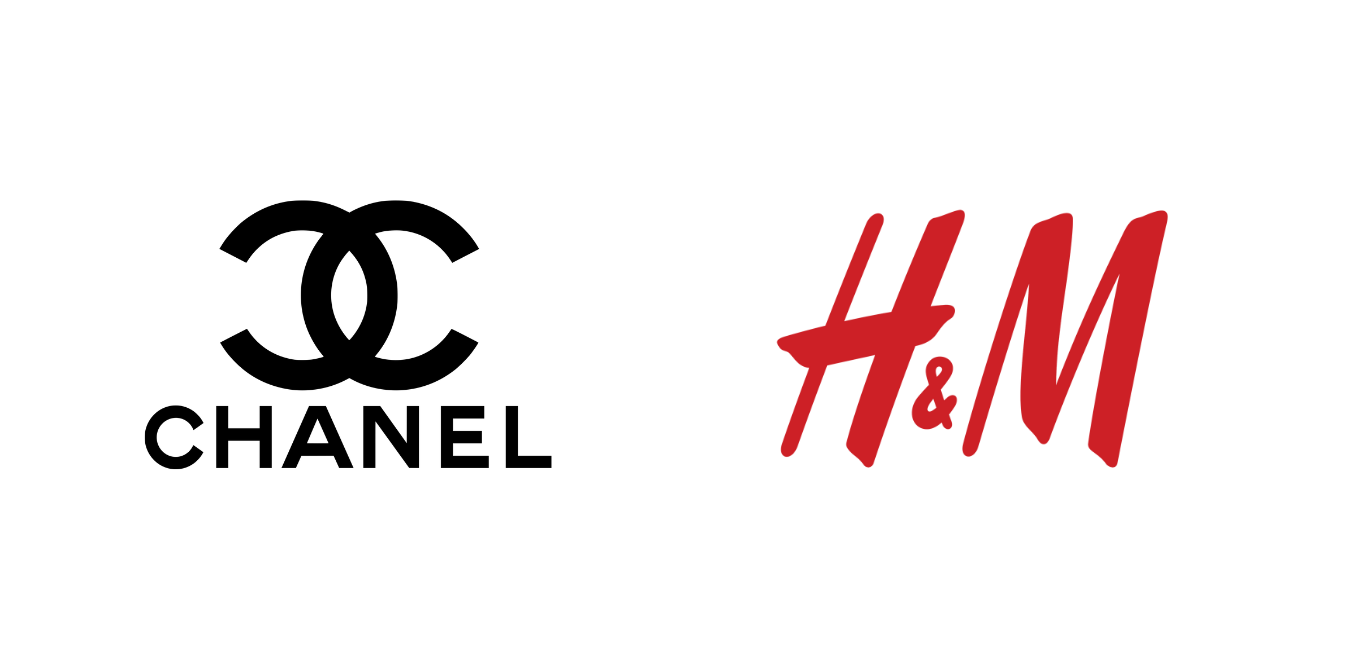
Letterforms, Lettermarks + Monograms
For brands with longer names, a lettermark—or monogram—logo is a perfect way to condense your brand identity and give it a high end or luxurious feel. These logos use a brand's initials to create a sleek, minimalist design that still leaves an impression. They are an excellent choice for brands with a “cult” following, as they allow for a subtle, low-key, yet still recognizable way to display and wear your brand.
Examples: McDonalds, H&M, Netflix, Chanel, YSL, Louis Vuitton
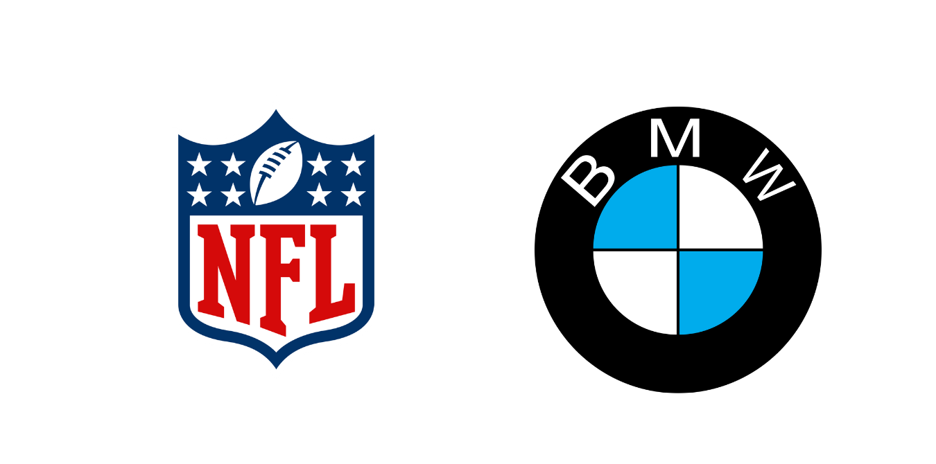
Emblems
An emblem logo combines text with symbols, often enclosed within a badge or shield. This logo style has a classic, timeless feel and tends to convey quality, trust and tradition. Think of it as a brand's crest- created to become a long-lasting and meaningful symbol.
Examples: Starbucks, NFL, Warner Bros, BMW, UPS, Converse, Versace
Pictorial
Pictorial logos are graphic-based designs that use a recognizable image to represent your brand. These logos often become universal icon symbols, like the Twitter bird or the Target bullseye.
Examples: Apple, Twitter, Target, Dominos, Shell

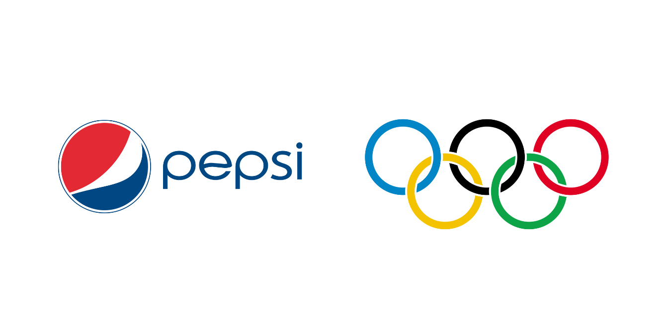
Abstract
Abstract logos are similar to pictorial marks but offer even more flexibility. They use a unique symbol or illustration created specifically for your brand. It's like creating your own visual identity that can evolve with your brand over time.
Examples: Nike, Pepsi, Spotify, Olympics, Slack, Airbnb
Character + Mascot
Mascot or character logos bring personality to your brand by using a character or illustrated figure. These logos give off a warm and approachable vibe that helps connect with a specific audience, making your brand feel more like a friend than just a business.
Examples: KFC, Pringles, Picards, Mailchimp, Michelin

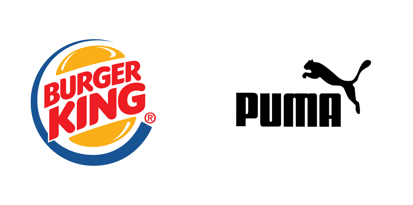
Combination
The best of both worlds - combination logos mesh imagery and text together to create versatile logos. These flexible designs are great for companies that want to evolve their branding over time without losing recognition.
Examples: Lays, Burger King, Doritos, Pizza Hut, Mastercard, Puma, Lacoste
✿ Written By Tori Warkentin
Hey there! I’m Tori, the in-house writer at Cedar + Mint Co.! With a deep love for words and a passion for storytelling, I specialize in crafting engaging, insightful content that resonates with readers.